Artist of the Week: Puffingmuffin
Mar 15, 2026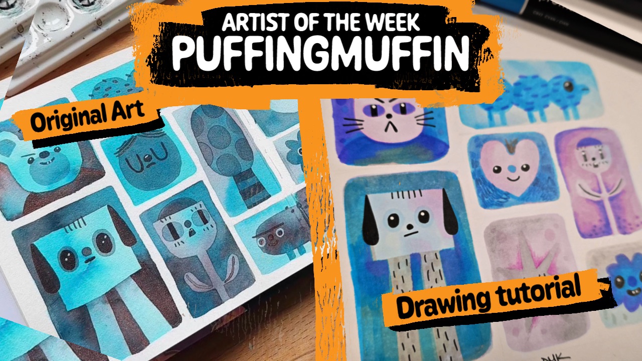
One of the fastest ways to understand how an artist works is to try drawing the way they do. Not permanently, and not perfectly, but closely enough that you begin to notice the decisions behind the drawing. The shapes they repeat, the colours they rely on, and the small structural choices that give their characters personality all become much clearer when you attempt to rebuild the image yourself.
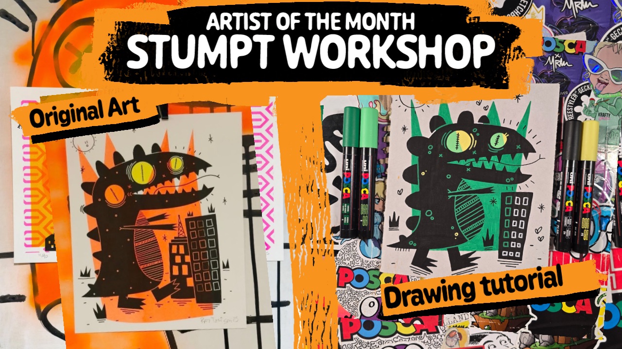
This week’s Artist of the Week is Candice Phang, also known as Puffingmuffin, an illustrator based in Singapore whose work is instantly recognisable for its playful characters and bright colour palettes. Candice originally studied architecture at the National University of Singapore before moving into the creative industry as a graphic designer. Illustration gradually became the centre of her work, eventually leading her to establish Puffingmuffin Studio, where she now works as both an illustrator and creative director. Her portfolio includes collaborations with brands such as Apple, Coach, Rimowa, Swatch, GUESS, Chanel and YouTube. Even with those big names attached, it’s the personality of the drawings themselves that tends to stay with you.
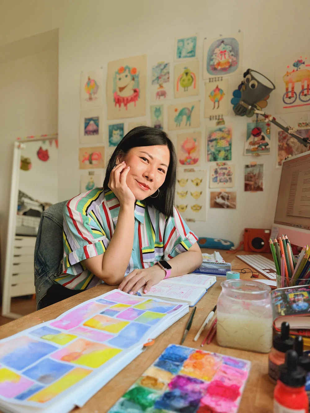
At first glance Candice’s illustrations feel cheerful and uncomplicated. Her characters are often built from very clear shapes and soft colour combinations, with expressions created from only a few simple marks. The drawings feel friendly and approachable, which is part of their appeal. At the same time, that simplicity hides a surprising amount of careful design. The balance between shapes, the spacing of features and the choice of colour combinations all work together to create drawings that really work.
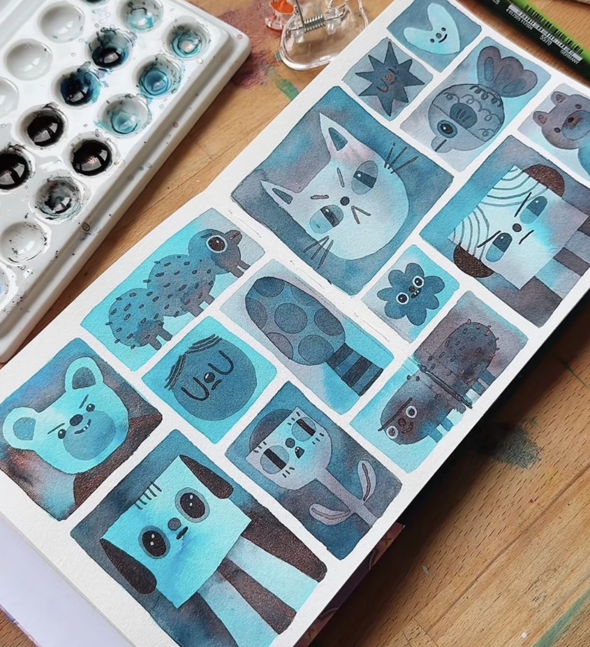
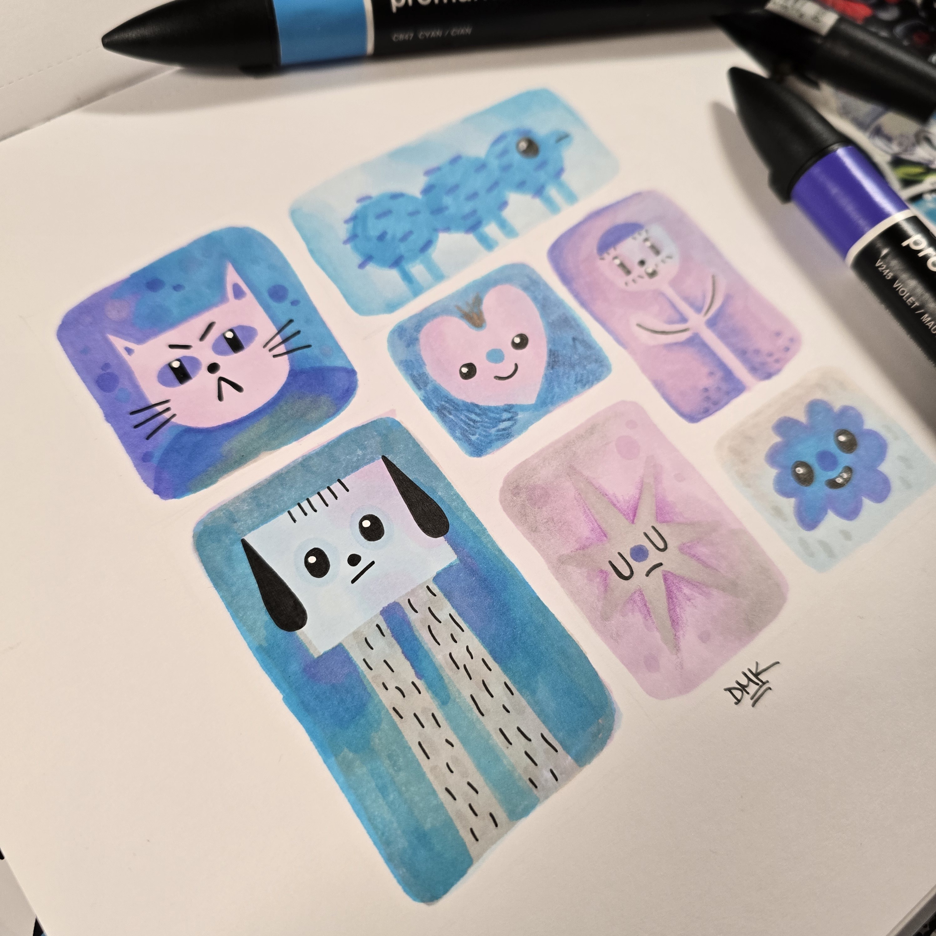
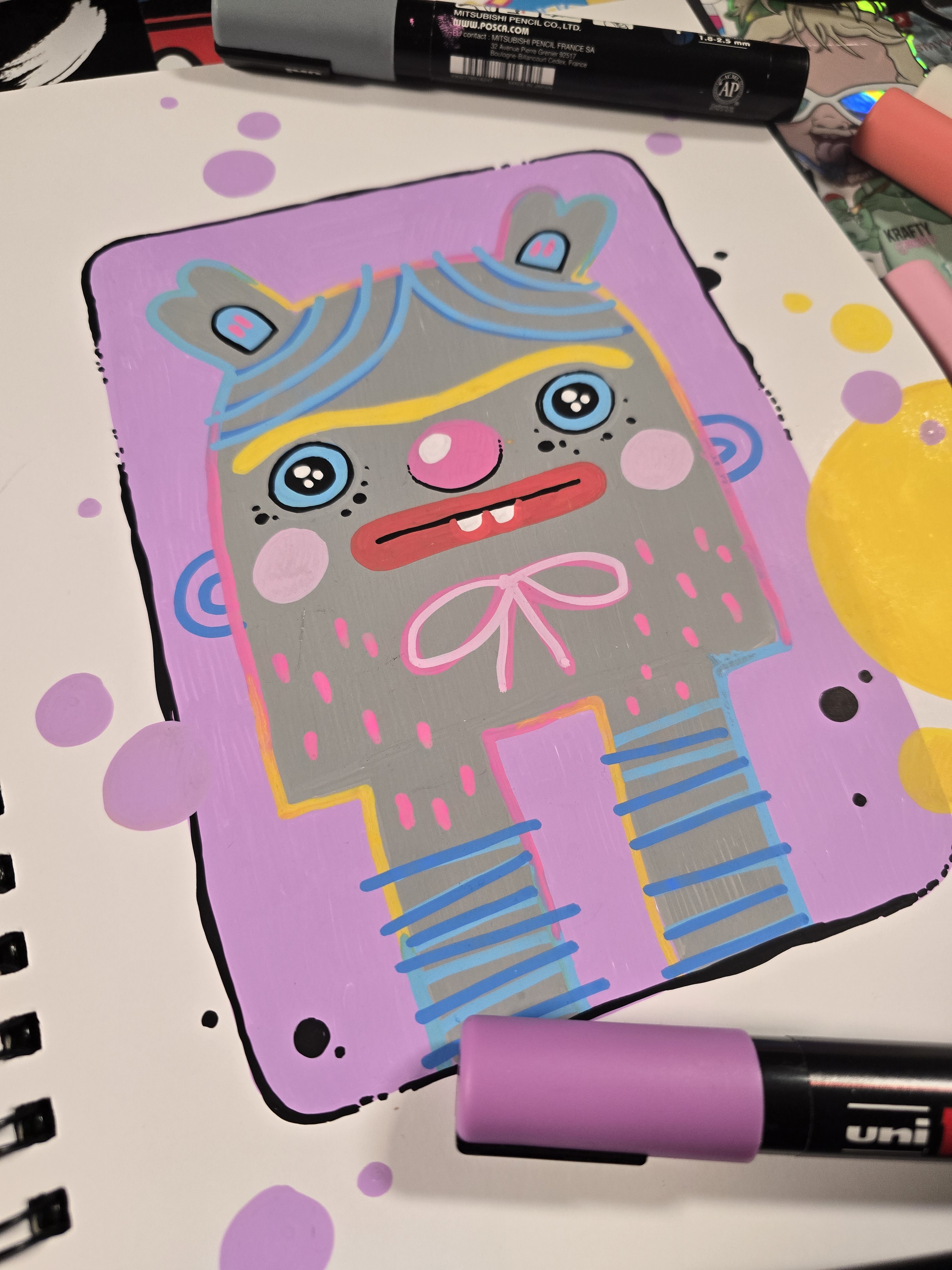
Candice often works with watercolour, which allows colours to blend gently into one another and creates soft transitions between tones. Most marker pens behave quite differently, usually producing flatter areas of colour that require layering or careful planning to achieve subtle variation. Translating a watercolour-influenced style into marker pens became a fun experiment because we knew that alcohol markers had the potential to replicate some of those blends.
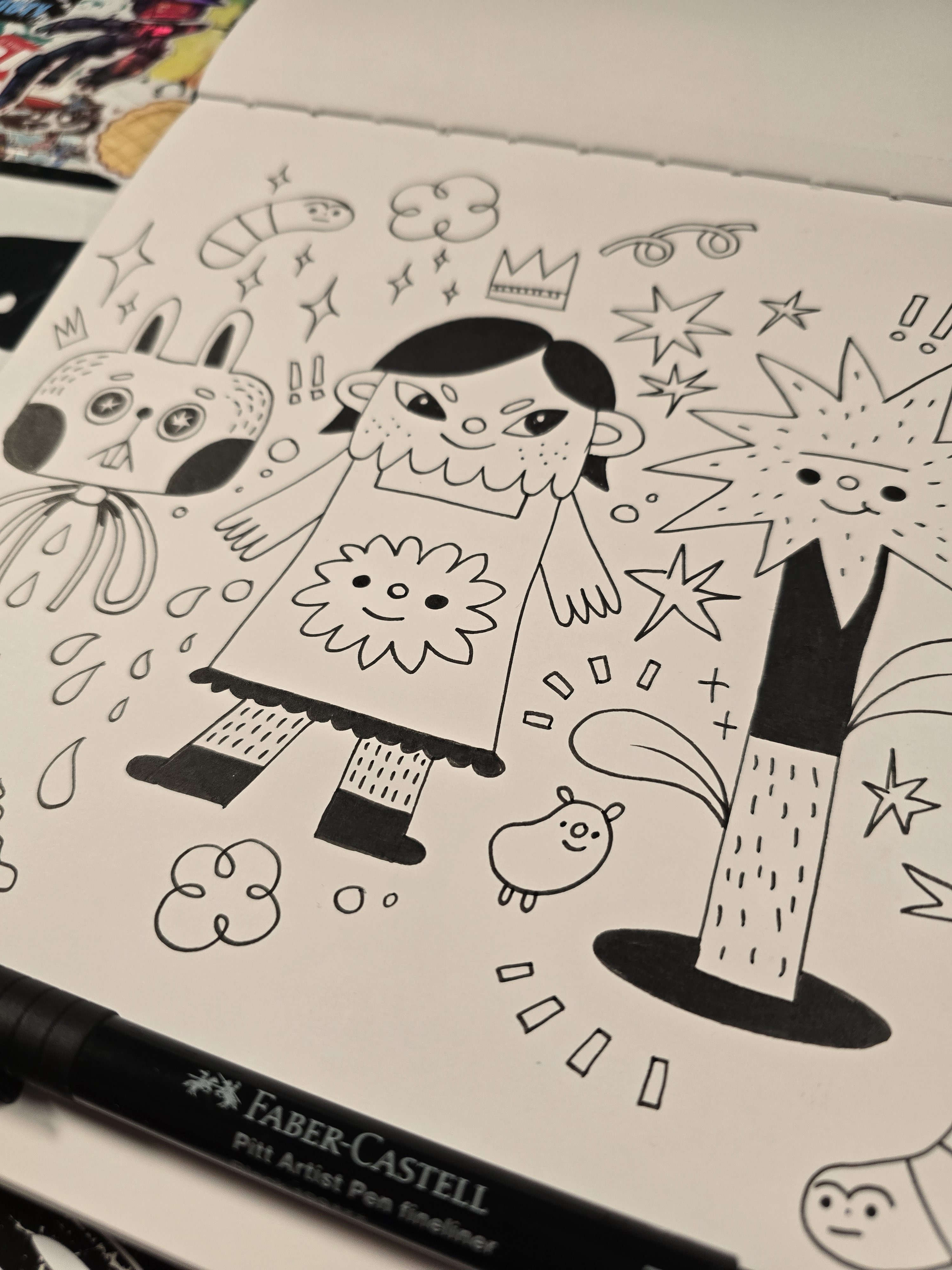
Breaking the drawings down reveals how economical Candice’s approach to character design can be. Many of her figures are built from just a few carefully balanced shapes, yet those shapes are arranged in a way that immediately communicates personality. Heads are often slightly exaggerated in proportion to the body, which draws attention to the expression and keeps the character feeling playful. Facial features tend to be minimal, but their placement is deliberate enough that even a tiny change can alter the mood of the character. These are the kinds of decisions that can easily go unnoticed when looking at a finished illustration but become very obvious once you try to reconstruct it.
Colour is another important part of what makes Candice’s work feel distinctive. Her palettes often combine soft tones with brighter accents that bring energy to the drawing without overwhelming it. Even when a character is unusual or whimsical, the colours tend to feel calm and balanced rather than chaotic.When working with marker pens, recreating that balance becomes an interesting challenge, especially as we usually rely on black lines to finish a drawing. Instead of using a flat black outline, we experimented with coloured outlines to better align with Candice’s approach and even attempted multi-coloured outlines with some success.
Working through these drawings also highlights how much personality can come from very small visual decisions. The curve of a line, the angle of an eyebrow, or the spacing between two shapes can dramatically change a character’s emotion. Because the drawings are built from relatively simple components, those small adjustments become more noticeable. It is a good reminder that character design is often less about complexity and more about clarity.
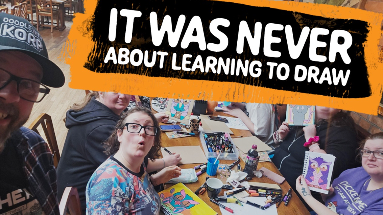
The most interesting part of Artist of the Week usually comes once many people attempt the same exercise. Even when everyone begins with the same step-by-step instructions, the finished drawings rarely look identical. Colour choices change, proportions shift slightly, and individual preferences begin to appear in the details. What starts as an attempt to study someone else’s style gradually turns into a collection of interpretations.

Looking through the drawings produced, you can see that process unfolding. Some interpretations stay very close to the original work, while others drift slightly into the stranger territory that often appears in Korp Academy drawings. Both approaches are useful because they show how influence naturally evolves once it passes through different hands. The lesson begins with observing an artist’s style, but it rarely ends there.
Studying another artist’s work closely enough to rebuild it changes the way you see drawings. Once you notice how shapes interact, how colour supports the composition, and how small details guide the viewer’s eye, it becomes much easier to recognise those ideas in other work as well. Over time those observations start to feed back into your own drawings, often without you even noticing. What began as an exercise in understanding someone else’s work slowly becomes another step in developing your own.
- Korp